författare - malyfred
/ 28. 11. 2005
If you want to see pictures on your monitor at least a bit like what the author wanted you to see – you should have a calibrated monitor.
I like for example my Dark skriker theme for this web but there are always a few people asking about the reason why I have completely unreadable website. Well, the problem is in their monitor adjustment.
There is a huge theory behind the monitor calibration and also quite many thick books have been written about this topic but I am not going to bother you with all that stuff. You should actually check just two (ok, three) things. Let's do it in two steps:
Brightness and Contrast
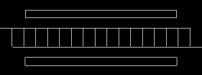
The pattern that should be visible on the next two images:

Try to play around with the brightness and the contrast as long as needed to make all "edges" visible on this picture:

If you have a really "shitty" monitor and you cannot find the settings that work with the previous image – try to do the same thing with this one (and you should consider buying a new monitor):

OK, the most important part is behind us and you can stop here.
If you have nothing to do or you have just realized that your monitor has actually quite many buttons that are changing "something" you can continue to:
Gamma
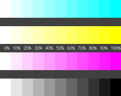
The gamma is a bit more problematic because the difference between CRT (you know, these old analog monitors) and new LCD displays is pretty big when you consider gamma curves. Anyway – you should be able to see the border between 90% and 100% at least on the last two stripes. Preferably the difference should be visible also on the first stripe. Don't care about the yellow stripe, that's another story.
Note: gamma could be hidden under the "Color temperature" in your monitor settings where it could be possible to change the values for Red, Green and Blue separately.

More detailed instructions: http://epaperpress.com/monitorcal/


